
Salford City have unveiled a new club crest option to supporters, ahead of a vote on whether they should change from their current crest.
The proposed change of crest is the second part of the club’s heritage consultation, the first of which saw fans vote for Salford’s home kit to revert to orange for the 2025/26 season and beyond.
The club have worked with global design agency MILK to create an emblem using iconic Salford elements that align with the club’s values and global ambitions.
The design was presented to supporters by co-owners Gary Neville and David Beckham, as well as Head of Creative Andrew Gordon. Of approximately 100 supporters who were in attendance, around 95% of the room would be in favour of voting in favour of changing the crest.
Ronan Joyce, chief business officer at the club, said: “It’s an exciting time to be changing to orange, reverting back to the club’s original colours next season.
“We could do that with a new crest. We’ve worked closely with MILK, who are based in New York. We’ve listened to the fans to see if we can bring something forward that’s best in class and represents our vision to the world.”
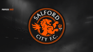
The club’s name returns to the crest, having been absent since 2014, when the current crest was introduced.
The change comes as the club looks to represent local artists and musicians that are ‘proudly telling the world who we are’. For example, the font was selected to look similar to typefaces used by iconic local bands such as New Order and Joy Division.
The current crest won’t disappear altogether, with the iconic floodlights at the Peninsula Stadium remaining in the same shape. As for the new crest, more than 100 outlines were explored, with the club deciding that a circular design allows more space to include multiple elements and add more layers.
Another noticeable change to the logo is the lion, which now faces forward, looking ahead towards the future. Previously, the lion had looked left and central, but the club wanted to represent its forward vision and ambition.
There is also a rose, another feature which has been on previous club crests and is instantly synonymous with features of the city, such as Salford Lads Club, the coat of arms and road signs.
The club plans to move forward with a vote between the current crest and the proposed crest in December, and supporters are encouraged to share any views here.


Keep the existing crest because it’s very unique just simply put an orange border around it instead of red.